Task 2: Visual Analysis & Ideation
Taichi Hirano 0366711
Bachelor of International Hospitality management (Honours)
This is the Module Information Booklet for this module:
Brief
Visual Analysis
| Title : "BACK TO THE FUTURE" |
|---|
| Size : 68 cm × 104 cm (27.0 in × 41.0 in) |
|---|
Phase 1: Observation
This artwork is drawn in a realistic style. The background is simple, with just a large parking lot and two streetlights. In the center is a shining time machine, two flames crawling on the ground, and a boy looking at his watch with a surprised look on his face. The sun is setting in the sky, and the orange of the sunset is swallowed up by the blue of night. The colors used are roughly divided into red, blue, black, and white, which creates a visual balance. Furthermore, the empty space is efficiently filled with the title logo, the work's message, credits, etc.
Phase 2: Analysis
The blue of the night sky and the orange of the sunset, as well as the boy's red vest and blue jeans, create a contrast between the red and blue colors. The three objects in the center of the poster - the time machine, the flame, and the boy - are arranged to appear united. The flames cast a red light on the time machine, which is actually silver, and the light from the time machine illuminates the boy's clothes, which are actually vibrant in color, lowering their saturation, adjusting the colors to create a harmony of colors.
Phase 3: Interpretation
This poster was created to promote the movie Back to the Future. It was created by Struzan, a master who has previously worked on movie posters for Star Wars, Indiana Jones, E.T., and others. It is believed that he used the expression of the time machine emitting a dazzling light as a cultural expression in science fiction works of the unknown emitting light. Correspondingly, the boy's expression is depicted as surprised. I think this expression is appropriate, as science fiction works often use expressions of light emitting from the unknown, such as cattle mutilations by UFOs and lost technology left behind by ancient civilizations.
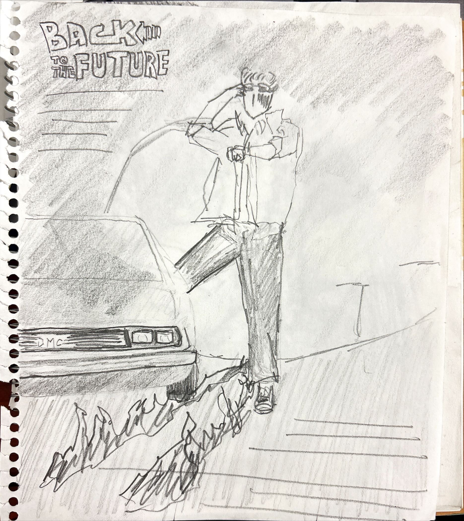
Sketches
Electrical emissions will be used to enhance the power of the time machine and its sci-fi atmosphere. By adding a pale, energetic electric current to the center of the unified art, the presence of the time machine in the center of the art is emphasized, and the boy's surprised face stands out even more.
This time machine is actually a modified car, but it's hard to tell from the original picture, so I'll draw the front of the car. If you actually look at the original picture, you can see the windshield and gull-wing doors, but the headlights are not where a car's headlights should be, and the doors are angled oddly to balance the composition. This makes it look like a truly unknown machine, and fails to convey the correct concept to the viewer of the poster.
The two flame lines are probably meant to represent tire tracks that have caught fire, so in this way we link them to the actual position of the tires. This is also a misaligned position to balance the composition. The tire tracks of the fire should be behind the tires, so this composition doesn't make sense. Therefore, I think it would be more natural to arrange the flames in a way that makes it clear that they were created by the friction of the tire and the asphalt.Feedback


You did not include the movie title in the sketches
ReplyDeleteThank you for feedback sir. I'll add it later
Delete