Task1 Exploration
Taichi Hirano 0366711
Bachelor of International Hospitality management (Honours)
This is the Module Information Booklet for this module:
My interests: The art/design work
The contrast created by the two opposing colors creates visual stimulation. It can also visually convey themes such as light and darkness, joy and sadness. I am interested in it because I think I can express it even though I am not good at drawing.By inserting a single, easily recognizable point of color into a painting or poster, you can clarify the important parts of the work, or conversely, give meaning to the surrounding objects. I became interested in this technique and wanted to try using it to create art with a message.
I think this is the main reason why I find beauty in artworks. It takes a lot of knowledge to create a work with harmony and unity created by similar colors and objects of the same family, but someday I would like to capture all of my favorite colors, creatures, sounds, smells, etc. in one painting.
3. My selected Art/Design
Gestalt Theory
| Size :39.2 cm × 67.6 cm (15 7/16 in × 26 5/8 in) |
|---|
I came across this work while
researching Gestalt theory. I have seen many other paintings, but as
someone who was born and raised in the countryside, I was drawn to the
scenery in this painting. What I like about this painting is that the
same scenery is contrasted between day and night on the left and right,
and I was fascinated by the way the geese flying in the sky fly from day
to night and from night to day. I am also drawn to the way the shape of
the fields on the ground gradually changes into the shape of the geese.
Looking at the cityscape below, I am impressed by the realistic,
monotone landscape, but I do not feel any discomfort in the way the
unrealistic fields blend into the shape of the geese, and am rather
impressed by how beautiful it is. I decided to introduce this painting
because of the strange experience I had observing it.
Contrast
| Title : "Café Terrace at Night" |
|---|
| Artist : Vincent van Gogh |
|---|
| Size :81.0 cm × 65.5 cm (31.9 in × 25.8 in) |
|---|
I love the contrast between yellow and blue. It evokes images of the night sky and stars, yin and yang, extroverts and introverts, and as someone who has had extreme mood swings since childhood, I feel a certain familiarity with this color scheme, so I like it. For that reason, I chose this piece, which clearly expresses the contrast between yellow and blue.
I don't like complicated art that combines many colors, and in that respect, this painting is broadly divided into three colors: yellow, blue, and black. However, that doesn't mean that there is no detail in this painting. While the sky, which should be truly dark, is expressed in blue, the shadows in the corners of the building are expressed in black, and from the perspective of the historical background, the light placed in the center of the painting is a so-called gas lamp, which was commonly used in this era and whose light was said to be very bright on a dark night. I love this painting because it conveys many messages and expressions even though it is not a realistic painting.
Emphasis
| Title : "Girl with Balloon" |
|---|
| Size : 30.0cm × 30.0 cm (11.8 in × 11.8 in) |
|---|
This painting is my favorite piece of art that I can think of that expresses emphasis. The artist who painted this is Banksy, and his face and identity are unknown, but I was moved by the way he suddenly appeared and left a painting behind. His paintings are basically painted with spray paint, and he often adds a single point of bright color to monochrome paintings. This art is simple yet somehow memorable, so I would like to introduce it here. To share one of his anecdotes, when this framed art, created in October 2018, was sold at auction, a shredder installed in the frame was activated and the bottom half of the painting was chopped up right there in the venue. This action further increased the value of the painting, and whether this action was a marketing move to increase the value or not, I am attracted to his style that overturns the conventional wisdom of art.
Barance
| Title : "The Last Supper" |
|---|
Artist : Leonardo da Vinci
|
|---|
| Size : 460 cm × 880 cm (181 in × 346 in) |
|---|
This
painting is a wonderful piece of art in terms of balance, with its
skillful use of space and perspective. When I first saw this painting, I
was shocked, even as a child, to learn that it was made more than half a
century ago. This is because it was so realistic that it could be
mistaken for a photograph, and for some reason, it had a sense of depth,
as if I was being sucked into the painting. For this reason, I thought
that if anyone were to explain balance, this painting would be it.
Repetition
| Title : "ASANOHA pattern" |
|---|
Year : 13th and 14th centuries
|
|---|
| Medium: Wood,cloth,Sculpture,etc. |
|---|
|
|---|
This
is a traditional pattern commonly seen in Japan. It has been used as
decoration for clothing and buildings since ancient times. The shape is
based on the hemp leaf motif. In recent years, this pattern has been
influenced by the anime "Demon Slayer" and has spread throughout the
world along with other traditional Japanese motifs.I have often seen
this expression in traditional Japanese festivals and in artwork, so I
would like to introduce it as a repitition expression.
Movement
| Title : "The Great Wave off Kanagawa" |
|---|
Artist : Hokusai Katsushika
|
|---|
| Size : 25.7 cm × 37.9 cm (10.1 in × 14.9 in) |
|---|
| Medium: Ukiyo-e, Woodprint |
|---|
This
is probably the most famous Japanese art. This painting is a work of
art that gives the impression of a giant tsunami about to burst forth.
What makes this painting so moving is the delicate touch used to depict
the splashes and movement of the water. As a Japanese person, I also
wanted to introduce this painting, so I chose it.
Harmony & Unity
| Title : "Endless Harmony" |
|---|
Artist : Christian Lassen
|
|---|
| Size : 126 cm × 95 cm (49.5 in × 95.0 in) |
|---|
|
|---|
Of
all animals, I like dolphins and killer whales, and I think his
paintings of living animals are better than any other paintings. For me,
born in 2000, Lassen's paintings were an everyday sight. At the time,
in Japan after the collapse of the bubble economy, Lassen's paintings
were often auctioned off and celebrities would brag about their
paintings on TV, so Lassen's paintings were that popular in Japan back
then. Although you don't see them much these days, his paintings of
happily swimming dolphins and killer whales are still beautiful, and his
paintings with blue as the main color are soothing. For this reason, I
thought I would introduce his paintings of the harmonious world of the
sea and the unified creatures it depicts.
Symbol
| Title : "imabari towel Japan" |
|---|
This
is the logo of the famous Japanese imabari towel. It was designed by
Kashiwa Sato, who has also created many other logos for Japanese
companies, including Uniqlo, all of which are simple, easy to
understand, and memorable.
Word and Image
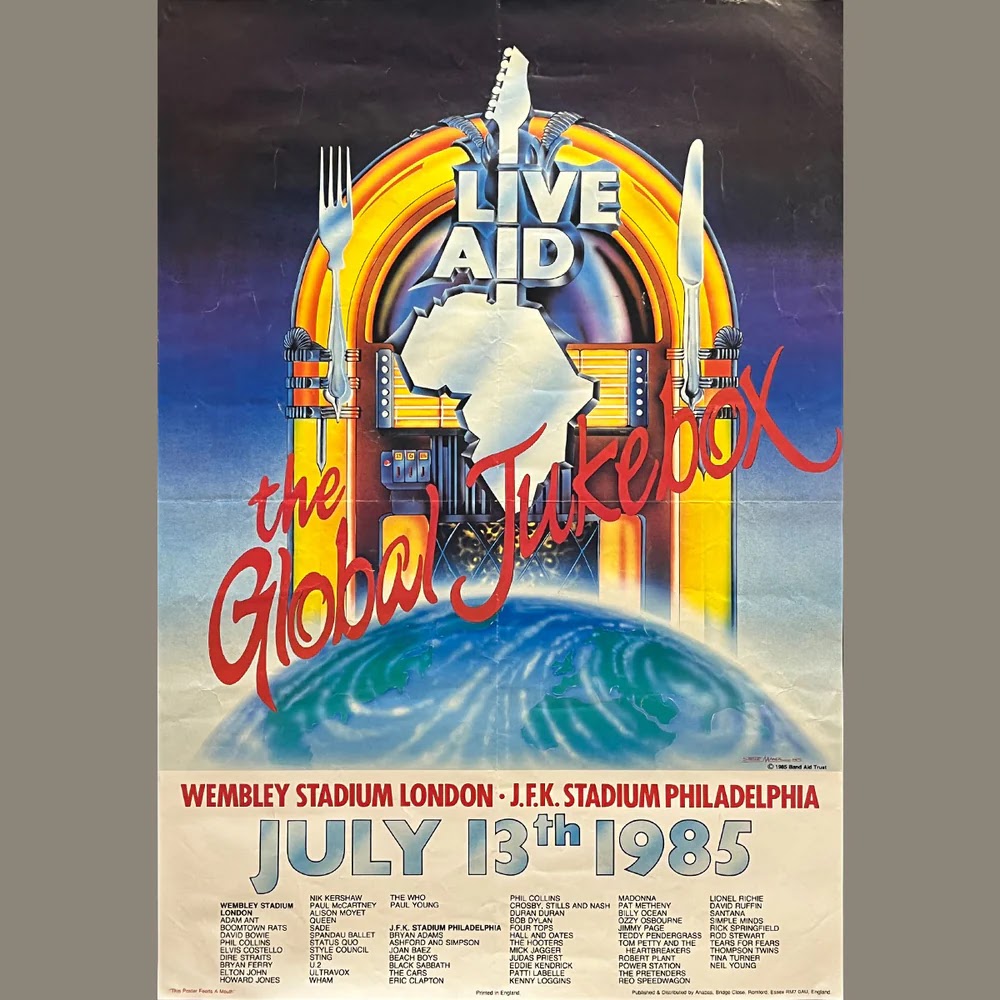
| Title : "Live Aid: The Global Jukebox (1985)" |
|---|
| Size : 61.0 cm × 91.0 cm (24.0 in × 36.0 in) |
|---|
I
chose this poster because I wanted to introduce my favorite posters
from Ward and Image. I first learned about this poster from a live event
that appeared in the movie "Qween Bohemian Rhapsody." This live event
was a charity concert held to help African refugees, and many popular
artists from around the world participated. It was an event that truly
connected the world through music. I remember the poster design being
cool as well.
Design Principles in this artworks :
Gestalt theory
I feel that many of the Gestalt theories apply to this painting. First, from the perspective of the Principle of Similarity,
the outline of the field gradually changes into the outline of a goose,
allowing us to recognize it as a goose. Next, from the perspective of the Principle of Closure,
we can see the silhouettes of black geese in a continuous flock of
white geese, and the silhouettes of white geese in a flock of black
geese.
Contrast
The
cafeteria emits light that is bright enough to illuminate the terrace
and the street beyond. This expression of light is juxtaposed with the
silence of the city at night, expressing the contrast between light and
darkness, bustle and silence.
Emphasis
The
elements of harmony in this painting are easy to understand: the
monochrome girl and the red heart balloon against the gray wall. In
addition to the harmony created by the contrast of vivid colors, the
image of the girl gazing at the balloon and the wind blowing away create
a story-like expression of the balloon being something important.
Balance
This
painting uses perspective to create a balanced look, with the face of
Jesus Christ at the center, creating a sense of spaciousness and depth
in the room symmetrically.
Repetition
This
pattern is made by connecting the tip of one hemp leaf to the base of
another hemp leaf, creating a hexagonal pattern like this.
Movement
The
lines of the waves create movement, while the mountains in the
background and the boat on the waves emphasize the size of the waves,
while the curve of the tips of the waves and the spray give a delicate
touch to the movement of the waves.
Harmony & Unity
First
of all, this painting is simple, with two dolphins swimming in the
center and the surrounding scenery in harmonious blue, and the position
of the light and the surrounding coral and seaweed are arranged to make
them stand out. The sea world is expressed with the dolphins at the
center.
Symbol
The
symbol conveys a message that the towels are made in Japan, with the
Japanese flag mark conveying the fact that they are made in Japan, as
well as the ocean, sky, and water that support the towels. Because all
Japanese people know that this is a towel company, the color scheme and
design are intended to convey Japaneseness, tradition, and a sense of
security.
Word and Image
This
poster features the symbol of the African continent in the shape of a
guitar with the words LIVE AID engraved on it. The poster also expresses
the Earth, which represents the connection of the world, as a place
where artists from all over the world gather, as the Global Jukebox, and
I think this poster links words and images.
My Interested Design Work
| Title : "BACK TO THE FUTURE" |
|---|
| Size : 68 cm × 104 cm (27.0 in × 41.0 in) |
|---|
Why I chose this art?
I chose this poster because it is a movie I personally like. This poster is a promotional poster for the popular science fiction movie Back to the Future directed by Steven Spielberg. This poster has an interesting effect. Those who have not seen the movie will read the words Back to the Future and guess what it means. Then, if you look down to the center of the poster, you will see a boy who seems to be the main character trying to get into some unrealistic machine and looking at his watch as if he is concerned about the time. You will guess that this is a science fiction story that uses a time machine, and you will be attracted to the light in the center and want to see the movie. In addition, the character is wearing American casual clothes combined with a down vest, which was cutting-edge and eye-catching at the time, attracting the interest of young people who care about fashion. In addition, the background of the road at dusk, the burning flames, and the dazzling lights are beautifully harmonized, and the movie title, synopsis, credits, etc. are placed in the empty space, making it a very well-balanced poster. Back to the Future has had two and three sequels, but the composition and layout have hardly changed, and the number of people and objects depicted on the poster increases with each sequel, which is also a highlight.
Design Principles:
Contrast
The flames stretching onto the road, the orange of the twilight sky, and the blue of the night sky create a contrast.
Emphasis & Harmony
The pure white light spreading from the entrance of the DeLorean (time machine) located in the center of the poster reveals the main character's expression and clothing, emphasizing his presence while also reducing the saturation of the bright colors of his clothing, making them blend in with the colors of the background.
Word and Image
Regarding the Back to the Future in the title,
firstly, by placing a left-facing arrow symbol next to "BACK" it is made clear that it means "go back," and by making "FUTURE" larger in font size it is made clear that the puzzling words "return to the future" are not a typographical error.
Balance
In terms of the balance of the space and object placement, the composition of this poster is tilted slightly to the right. This is because if the angle is the flat, the protagonist's face will be tilted slightly to the left, making it look like he is being sucked into a time machine. It is considered a composition that takes into account the balance in order to make the protagonist's body look straight.
FEEDBACK
week2: Selection of appropriate art and proper explanation for the Gestalt theory part week3: Lack of explanation for the final artwork.
About blog text placement


_-_The_Last_Supper_(1495-1498).jpg)


Comments
Post a Comment